 |
| After picture, still personalizing the wall |
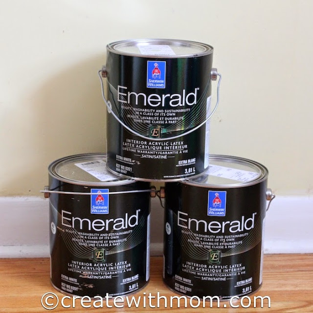
Our recent project was to update and renovate the children's bedroom. I chose the Shagreen Sherwin-Williams' Emerald paint for the walls, and the cotton white and creamy white for the ceiling, trims and door.
Using the Emerald paint eliminated the need for priming first. I also found that the smell of the paint was not too strong, and the smell didn't linger. The Emerald paint works well on smooth walls, and if the walls are not perfect it will show.
The above and the below are some pictures of the room before we updated.
We first prepped the room by removing the wallpaper, and the wooden trim that was in the middle of the wall. Then we filled all the holes and other little things on the wall and sanded to make it smooth before we painted.
Since we did the painting between work and other busy things in life, we had to pause many times during the project. The roll and stow came in handy during this time, as the paint on the brushes didn't dry when it was stored overnight inside the roll and stow.
I really like how it turned out and the green I chose, as it is not too dark or too light, but vibrant and gives the room a fresh feel. We went with green since my daughter and son are sharing the room and each of them have their own sides. I feel green is an uplifting, pleasing natural colour, and we need exposure to this colour a lot since we see very little green throughout the year.
Going with dark colours of paint can be uplifting, which is why Sherwin-Williams Color of the Year 2015 is Coral Reef. This hue with floral notes is the perfect mélange of pink, orange and red that can be used to liven up any space. The Sherwin-Williams Buoyant palette, Coral Reef channels floral components, which are prominently featured in current fashion trends. Other palette colors are reminiscent of vintage floral patterns, influenced by natural-healing botanicals and the trend for green urban spaces.
All rights reserved on photographs and written content Createwithmom © 2011 - 2014. Please Ask First


The room looks great. I like the green color you chose. It really brightened up the room nicely.
ReplyDeletewow! awesome job! Luv it!
ReplyDeleteI know that it is in the 'before' picture, but I do like the lower wall for letters. I've seen the chalkboard, but find it can make hands that are a little too messy.
ReplyDeletejan
I like the wooden letters on the wall too. I put them up with modpodge when my children were small now I am trying to decorate the wall with their art work :) and we are still working on it.
DeleteWhat a great room makeover! I love it!
ReplyDeleteRAFFLECOPTER NAME is Anne Taylor
The lower wall use for letters is a great idea, I might incorporate that into my kids playroom
ReplyDeleteLooks great!
ReplyDeletegreat job it looks awesome
ReplyDelete